“Another soda rebrand?” It’s the question we’ve asked ourselves each and every month since January 2023. The biggest soft drink brands seem to be locked in some sort of visual expression tug of war; every month, one company or the other has launched a total redesign of one of its subsidiaries—which prompted us to wonder: why? Turns out, these are not just random rebrands. Upon closer examination, the rebrands can tell us a lot about current culture and what’s in store for the future of this carbonated category.
In analyzing each rebrand, we were able to pinpoint a few interesting themes these sudden shifts in soft drink design have in common: each is leaning into the “joyconomy” through playful and uplifting visuals and/or messaging—a natural pairing with the products’ bubbly effervescence; each is leveraging retro cues to wax nostalgic and remind audiences of their status as long-time industry players; and each can likely be chalked up to a somewhat panicked attempt to capture younger, traditionally soda-indifferent generations.
All of which culminates in the tireless push-and-pull of the PepsiCo vs. Coca-Cola soda war that has been bubbling up for decades. Let’s recap the year’s fizztivities.
January
Starry overtakes Sierra Mist
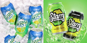
The year started out with the end of an era—the Sierra Mist era that is. PepsiCo pulled the lemon lime Sierra Mist from its line-up, replacing it with a new and improved lemon lime Starry. Visually, there was a big leap between these two brands.
Sierra Mist relied on gradients throughout all of its packaging, emphasizing the narrative of blending lemon and lime. Typography was sharp with unique serifs, accentuating its crisp flavor. Brand elements included a realistic mountain feature anchored on a colorful lemon lime slice. Although Sierra Mist was one of the most popular US sodas in 2021 it could not compete with the popularity that is Coca-Cola’s Sprite, so PepsiCo retired it in favor of a replacement that could target new markets.
How does Sierra Mist’s successor Starry visually connect with consumers? It hits different. With its simple yet bold color blocking, treating both the lime green and lemon yellow equally in the visual space, the can stands out against the sea of green in lemon lime soda design. The design is targeted toward Gen Z’ers with its bold retro star prints and simplistic fruit treatments.
Key Design Takeaways:
- Gen Z targeted
- Color-blocking treatment
- Unique palette in category
- Retro, bold, and simplistic
February
New Get Up. Same 7UP.
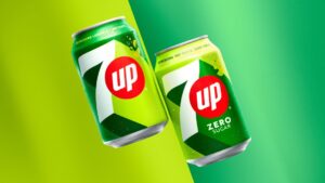
Speaking of Sprite competitors, we couldn’t forget 7UP, who followed closely behind in Starry’s footsteps for a rebrand the following month. This rebrand also relied heavily on color blocking and simplified visual treatments. The extreme drop shadow now featured behind the updated “7” tells their uplifting narrative, making the brand’s visual identity feel bright, daring, and confident. 7UP did stick with their classic primarily green color palette with the small pop of red to highlight “UP”. They are attempting to target a younger generation of consumers with their optimistic messaging, launching the new slogan “New Get Up. Same 7UP” as a clever way to attract new attention while reminding those who are loyal that they’re still the lemon lime consumers know and love.
Key Design Takeaways:
- Confident and minimal
- Uplifting
- Classic palette to retain their loyal customer base
March
Unapologetically Pepsi
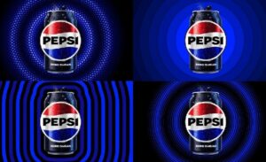
The third month of the year brought on a rebrand of the iconic Pepsi. Pepsi has been in the market for 125 years, and has evolved their branding only a handful of times. But this year brought on not only an evolved color palette, but elevated logo and typography.
Pepsi’s newly evolved logo is hugely impactful compared to their previous treatment. The bold, strong typography features unique treatments to the “P” and “S” to match the legendary “wave” in their historic Pepsi globe mark. The worldmark now daringly fills the white space of the iconic Pepsi globe.
The new color palette continues their narrative of being unapologetically modern with the introduction of a vibrant electric blue and black. The stark contrast between these colors exudes a contemporary edge for this legacy brand. And finally, the newly introduced can silhouette serves not only as a “pulse” treatment of Pepsi—making waves as a reminder of its legacy in music culture—but also as a subtle jab to its main competitor The Coca-Cola Company, whose bottle silhouette is universally recognized.
Key Design Takeaways:
- Unapologetically modern
- Disruptively bold colors; fresh and funky
- Built on heritage but fueled by contemporary elements
April
Playful Fanta
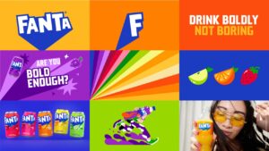
Coca-Cola’s Fanta global rebrand is the definition of stripping back to minimalist to allow for maximum scalability. This playful giant is available in over 100 flavors around the world, which required simplifying their existing logo to be as flat and monochromatic as possible, in order to allow for unified global execution.
The minimal logo evolution saw the removal of both the classic orange circle and leaf from the design. Replacing those elements with a bright blue color block and dropshadow coming down to a sharp point emphasizes the logo bursting forth with flavor. This logo treatment allows for flexibility and functionality within their custom typography.
From the logo evolution we see their massive color palette pair with their mammoth flavor offerings. Each flavor is anchored in a bright and vivid color execution as well as subtle fruit and illustration elements as they target the optimistic Gen Z’ers. This new visual identity is all about being fun and popping off the shelves.
Key Design Takeaways:
- Gen Z targeted
- Playfully colorful
- Flattened minimalism
- Global scalability
May
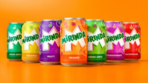
Vibrant Mirinda
Directly followed by Coca-Cola’s global rebrand of Fanta (coincidence? We think not), PepsiCo introduced a new identity for their international and boldly flavorful Mirinda brand. Similar to the execution of Fanta, Mirinda has more than 50 flavors world-wide and relies on a flexible identity to represent all of their flavor offerings.
Although the Mirinda wordmark is practically unchanged, the introduction of a white punched-out “M” serves as the foundation for the mark introduction. The sharp angles of the “M” pointing through the busyness of the can design tells the narrative of loud, dynamic energy. Each flavor has its own color palette, paired with simple illustrated bubble treatments and whimsical fruit drawings. If its competitor Fanta went for minimalistically fun, Mirinda nose dived into maximalistically vibrant. As far as the line-up in the year of beverage rebrands, Mirinda has the most crowded package design with all their layered elements.
Key Design Takeaways:
- Gen Z targeted
- Vibrant variety
- Lively illustrations
- Busy
Conclusion
So what can this marathon of carbonated rebrands teach us about broader visual identity design trends? In a post-pandemic market, audiences are craving uplighting messages and minimalist design (and adding a hint of nostalgia never hurts). They also prove that less is more when introducing color palettes and brand elements. In other words, there’s no need to fill your design space with noise—it’s better to be intentional about the message you’re conveying by focusing on the essential elements only. Lastly, the perfect rebrand is often a balance between maintaining the familiarity of existing core equities while having the confidence to keep things fresh.
So what do you think? Who will be next in this stream of visual soda shake ups?