Every other year, for one season, the Olympics take the world’s stage in a way that few other brands can. The anticipation and coverage puts the host city and its country in the spotlight for much longer than just the weeks of competition. And a key part of preparing for the attention is building a brand to live alongside the iconic rings.
The strategic challenge is to build a creative visual identity that highlights the uniqueness of the location, creates excitement of the event, with a global appeal that transcends language barriers. This month, Paris—the host for Summer 2024—unveiled their “Look of the Games” including pictograms for each sport.
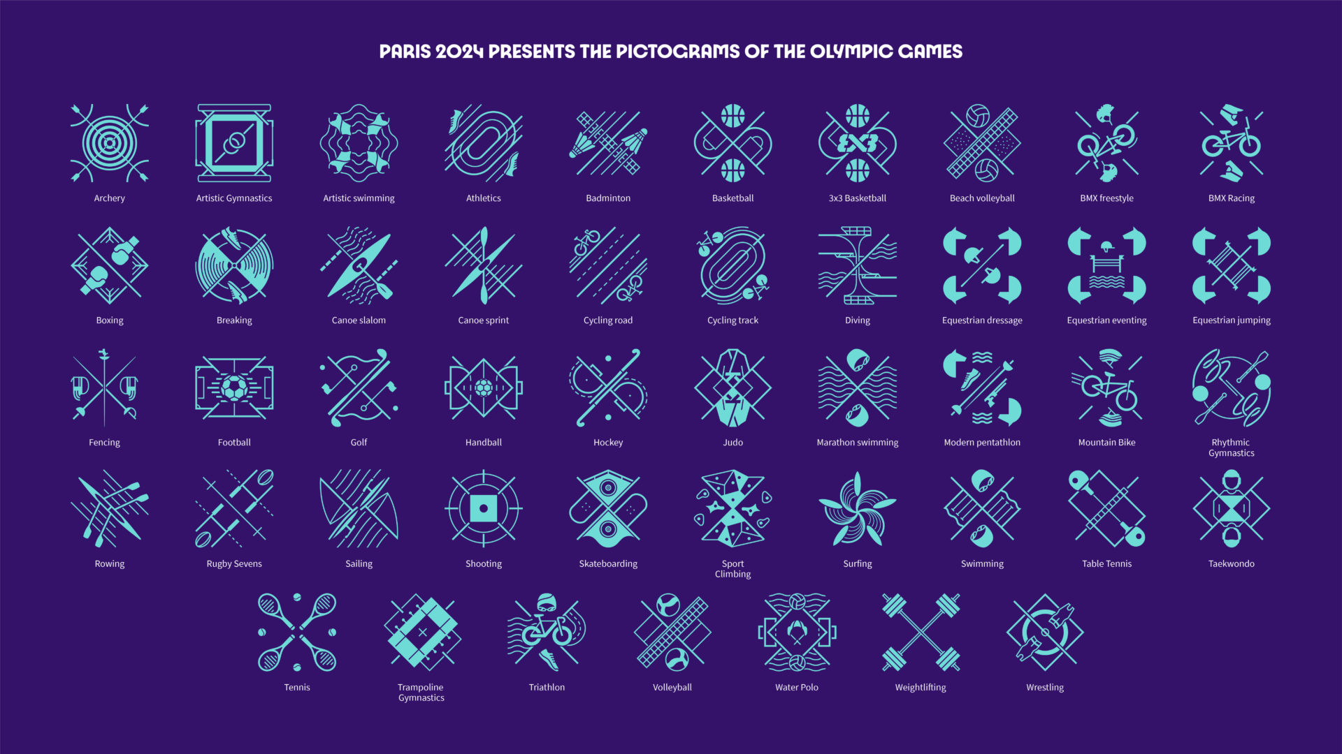
The goal of these symbols is to create a visual representation of the sports that can be universally recognized and understood by any spectator from any country. If you’ve tuned into coverage of the Games since 1964, you’ve seen them as a part of the programming, but they are also used onsite as directional icons. Historically, these pictogram have featured a full-bodied, stylized athlete in competition.
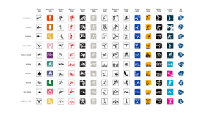
Paris has opted to remove this familiar token for only the second time in history, choosing to depict the tools and playing field of the sport around an axis of symmetry. For example, the three-point arc of a basketball court paired with the ball for basketball. Or the lanes of a racing pool paired with a cap and goggles to represent swimming.
The strategic idea was “elevating [the pictograms] from mere visual aides to striking coats of arms serving as rallying cries for sports fans” according to the official website. The final product has the added benefit of inclusivity with 8 of the 62 pictograms being used for both the Olympics and Paralympics.
Visually, they are a fun and modern twist on the typical pictogram—something you may not have otherwise noticed was changing from year to year. The design, however, also creates complexity where simplicity is key. With any branding endeavor, strategists and designers must balance creativity with function keeping in mind the ultimate intended use.
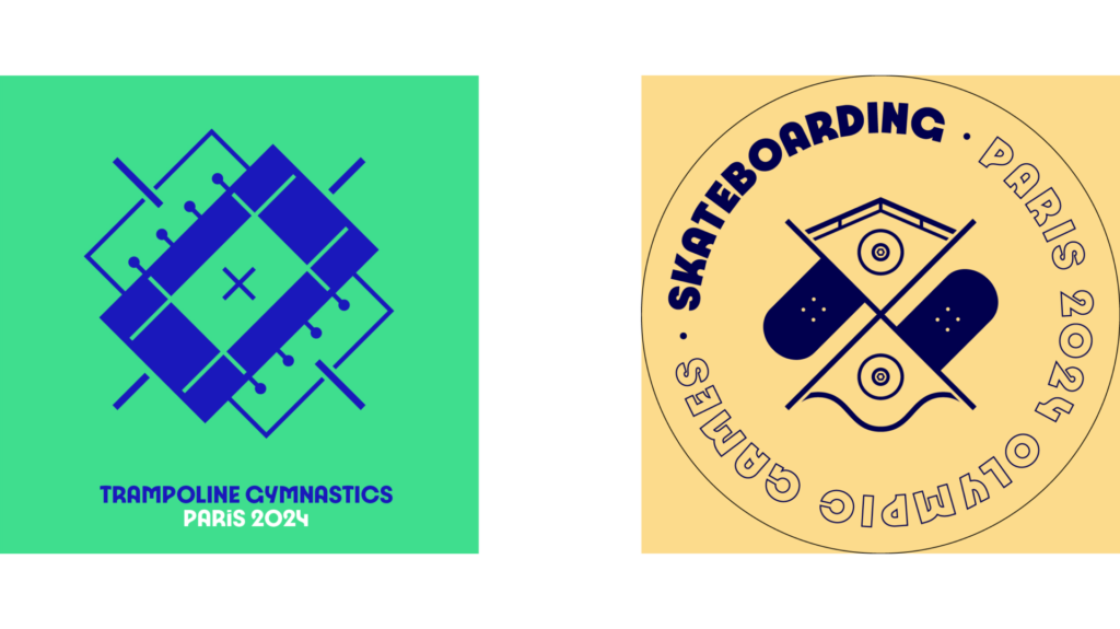 While the pictograms are cool images we would be tempted to buy on, say, a souvenir, they are not immediately recognizable visual aids. For example, without the descriptions, it would be difficult to decipher the trampoline gymnastics from a football field and easy to mistake the skateboard symbol for your run-of-the-mill Bandaid. So although we applaud the creativity and appreciate the symbolism, the design would likely not achieve gold-medal status, as it ultimately falls short of its intended purpose—to be immediately intuitive and globally recognizable.