B to B

Making black and white the new healthcare blue

The Challenge

With so many product and service offerings, MGMA needed a more unified visual identity and naming structure to help consumers better understand what it offers.

The Outcome

A highly differentiated brand personality, brought to life through a fresh visual identity, newly named service lines and a multi-faceted campaign to support it all.

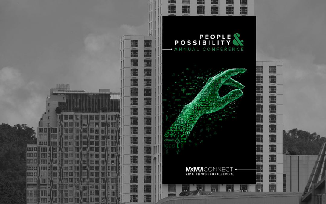
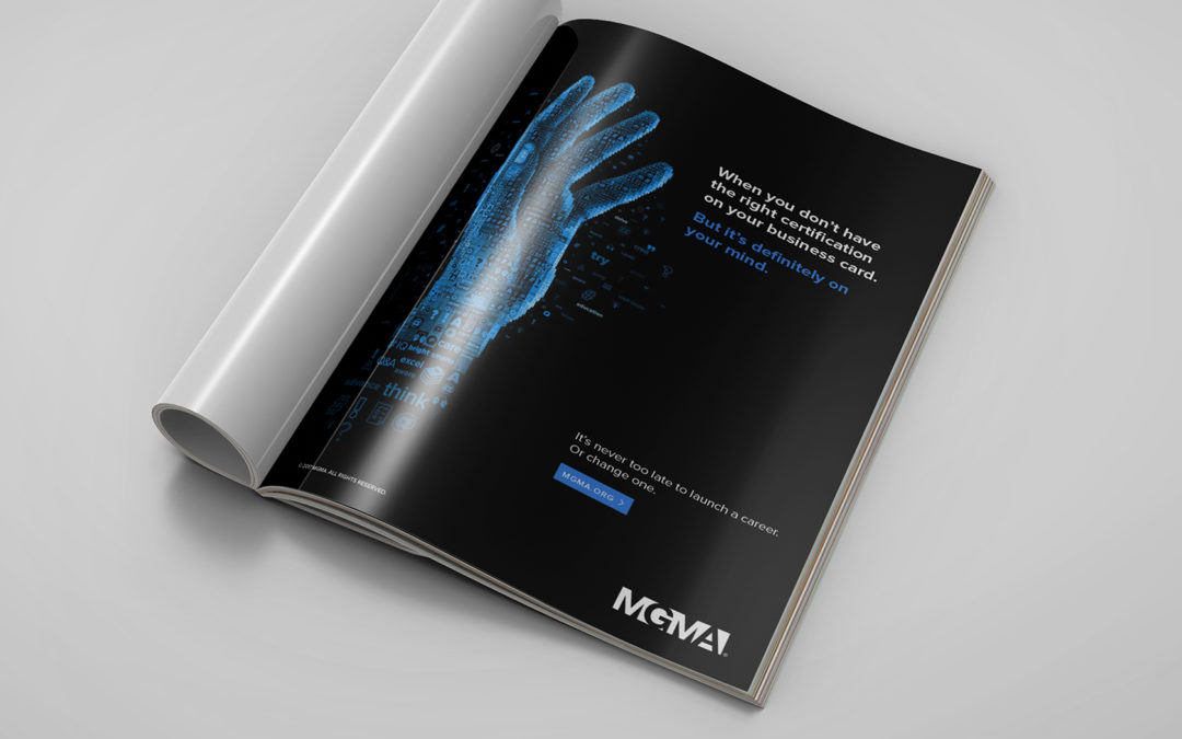
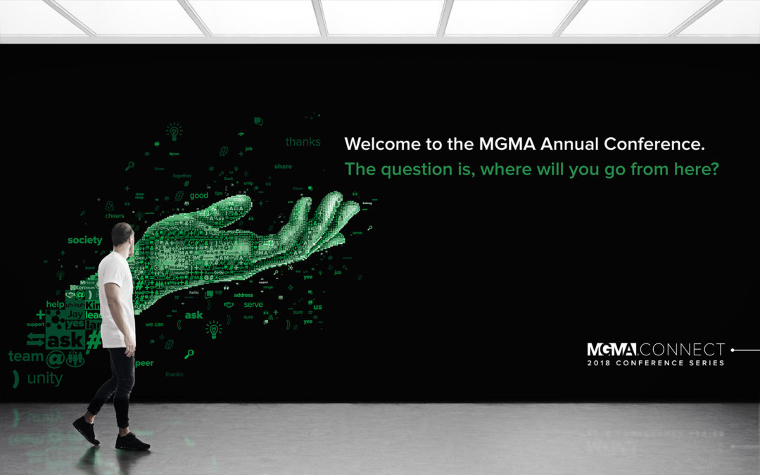
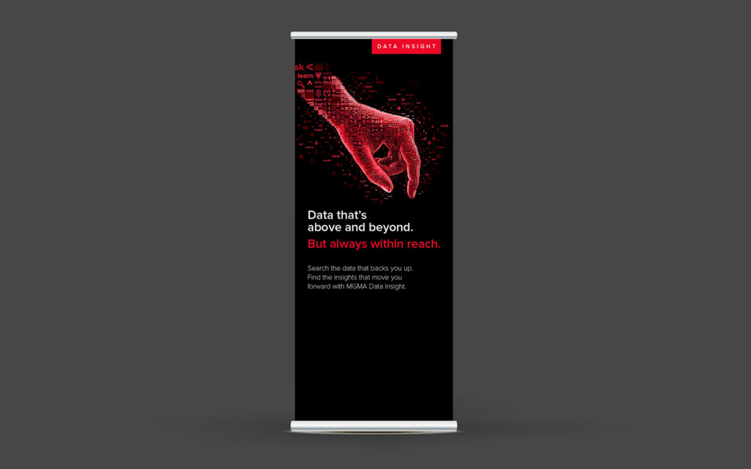
The Medical Group Management Association was a well-known name in the healthcare industry, specifically revered for its presence in data benchmarking for practice administrators. After conducting consumer research, we identified the consumers’ need for something new—far from healthcare blue and closer to conversational, approachable, real. After defining its new visual identity, we renamed their service lines to make them action-oriented and applied a tone that felt magnetic, supportive and smart. After identifying the key user benefits of each service line, we activated the campaign visually through custom, collage-style art to represent the vast intricacies of practice management.

Please enter your name.

Please enter a valid email.

Please enter a company.


Select one category

Please choose one category.


Select one or multiple services

Please choose at least one service.


Select a budget range by clicking on a price or a hash mark

Please choose at least one service.


Please enter a message.

We look forward to learning more. A BrandJuice team member will follow up with you directly.

Back
01 / 07
01 / 04
Next