This is an unofficial statement on the trials of designing a cannabis-fueled brand.
The industry is in sticky (eh?) spot right now when it comes to strategies on branding. And in an even trickier situation when it comes to packaging. While attending Denver Startup Week last year, I attended a few sessions on the cannabis track. There were halting alerts surrounding social media account shut downs and nervous energy around the question, “Well, what can we say?”
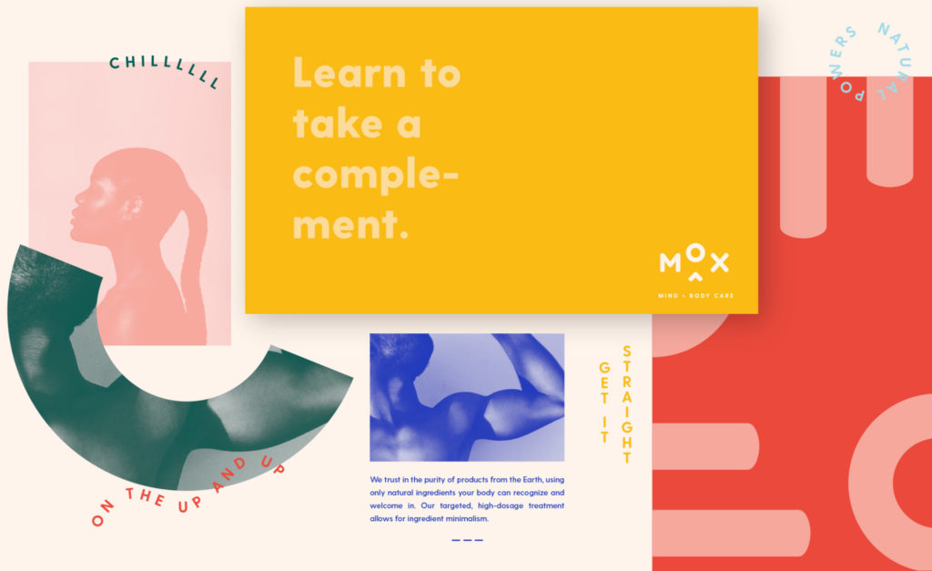
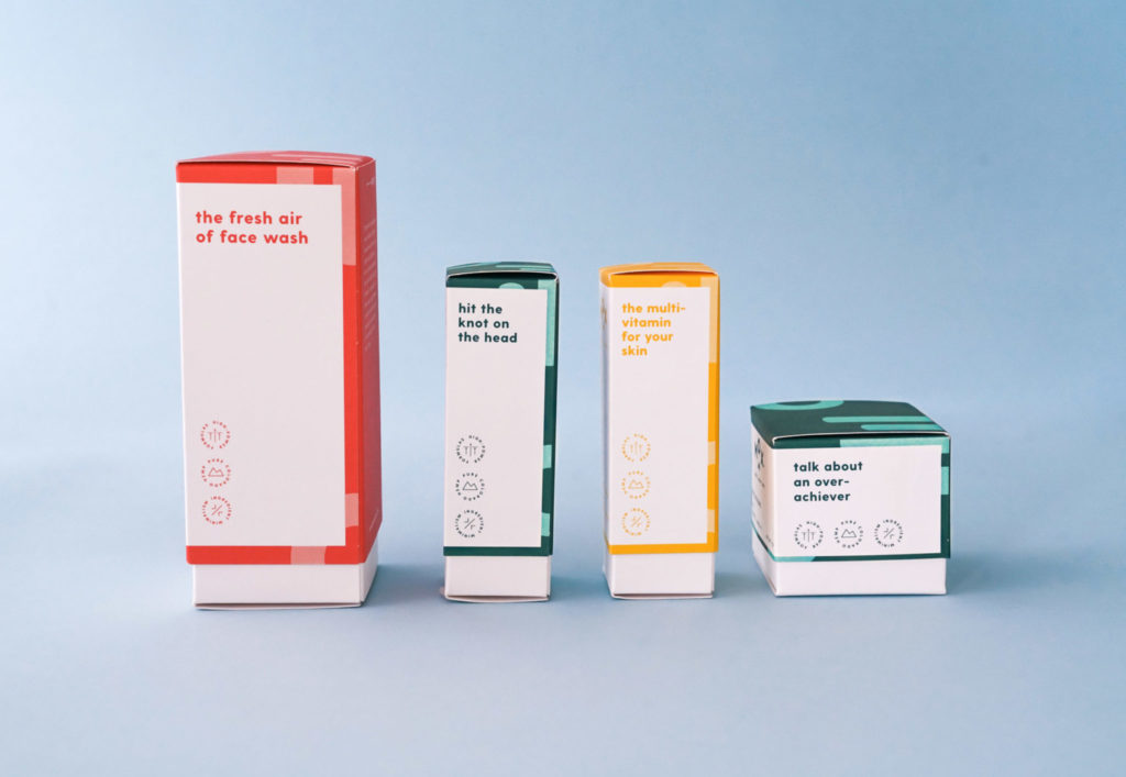
Over the past year at BrandJuice, we have incubated a benefits-first skincare project called Mox Mind + Body Care. The goal: create a gender-neutral brand with expert nutrient formulations enhanced by the power of CBD. So now that I’ve truly been in the weeds (hey-oh) on this topic, I have a few tips for how designers can make dope projects like this a little bit easier:
Create a Design System
Okay, really you should be doing this for every brand. There needs to be a hierarchy of tone and content with a strong strategy for utilization of graphic elements. For Mox, we created a layered system that implied movement and emotion. Through this we were able to make a startup brand, that launched with minimal visual assets, look alive.
Since a system is by definition an “organized method”, you can use these self-created “rules” to put an understanding on the personality and creative expression. Create foundational elements with fortitude and permanence so that you can retain flexibility and artistic license on other items in your system. This also allows for easy future expansion of the product line. Remember: a successful brand must be able to scale.
There are some great examples out there for how design systems have been implemented (check this Starbucks one).

Plan for Contingencies
There will be surprises. You will likely spend weeks, if not months, in legal review. Tweaks to wording one day can snowball into larger changes to your product line overall. (Build that into your timeline). But that doesn’t mean your work quality overall needs to suffer. Through your research process, you’ve likely identified areas in messaging, packaging claims, etc. that feel a little less secure than others. Take note of these potentially precarious areas early on in the project, and keep an eye out for ways to get ahead of them. One great place to start is by making sure your design specifications are solid when it comes to FDA guidelines. That can end up saving you a lot of time on the backend with proofing.
And when it comes to placing your product, you will likely find that each retailer is looking to speak to its consumer in a way that creates a unique and ownable experience. In order to meet these goals, your brand needs to balance maintaining its core essence and being a good partner. This is where your design system really puts itself into action. Plan to be agile and use the scalable elements of your design to bring that experience to life.
Clean Up your Files
Packaging means paper samples, PMS matching, and printing techniques. In other words, the stuff designer dreams are made of. But your first step should really be building a great relationship with your printing partner. Chances are, they know more than you about this stuff. They’ve seen it all. At the same time, they want to make something beautiful and impactful too. Go visit them and have some frank conversations about all of the possibilities. They may just have some super cool trick to accomplish that coating feel you want without a massive cost increase.
Once you head into production on dielines, take the time to make clean files for pre-press. Give them access to color codes and delete the unused swatches. Use labeled layers in Illustrator. And when it does come time to make a tweak to the way we talk about CBD claims, they are much more likely to oblige on their end.
It’s not often that we get to witness industry-shattering goods burst onto the scene via legalization. Cannabis is a conversation-thickening agent making its way into the consumer stream as an “ingredient”. The team and I are pretty pumped to continue exploring how it works in tandem with other active ingredients to create seriously inspired products.
